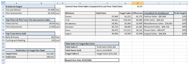
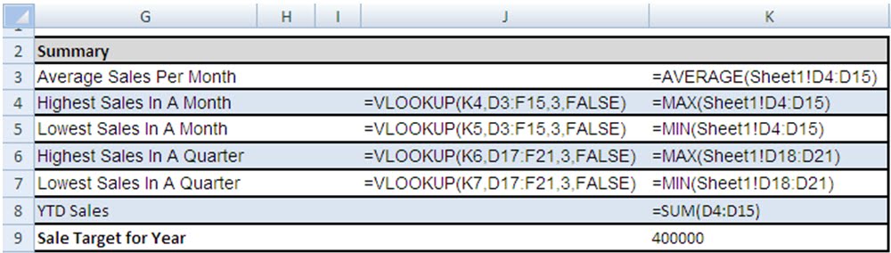
In a previous post I demonstrated a simple but effective dashboard but did not go into how to create it.
I will do so in the following post.
As with any dashboard, it all starts with the data you have and what you are trying to convey. A good dashboard will be easy to understand, (clear and concise). It will convey the data in as few steps as needed without losing key points. It will also not obfuscate key points by surrounding them with superfluous information.
For my demonstration, I will create almost the entire dashboard from one key data series (Sales per Month).
Month | Sales |
Jan | $ 20,947 |
Feb | $ 45,494 |
Mar | $ 35,173 |
Apr | $ 20,249 |
May | $ 47,792 |
Jun | $ 42,511 |
Jul | $ 28,343 |
Aug | $ 28,343 |
Sep | $ 28,000 |
Oct | $ 27,161 |
Nov | $ 17,864 |
Dec | $ 29,987 |
Now to start my dashboard I first need to set a color theme. I personally don’t like dashboards that use dozens of colors. In my opinion they tend to end up looking like something from a circus. I prefer a sleek look and try to minimize my color pallet. For this example I will use variations on shades of blue.
So now that I have my data, know what my key points are, and color tablet; I can now begin.
I am going to stop for a moment and vent a bit… Quite often managers don’t know how long it actually takes to create a useful dashboard. A good dashboard is so simple to understand that the development side is often overlooked. A general rule of thumb is that the design and planning of the dashboard will take about 70 percent of the time it takes to create it. The other 30 percent is the actual creation. A good dashboard is almost always used over and over so it needs to be easily updated (so be sure to plan ahead).
So we plan what we are going to design and then design what we plan.
Now having said that, don’t allow yourself to be pigeonholed by your initial plan. Some times as you actually create the dashboard, inspiration strikes. But I digress….
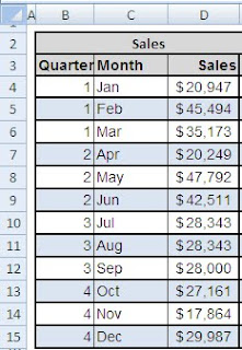
To start I first highlight the entire worksheet and change the background to white. This removes the gridlines. I then enter in my data In cells C3..D15 and then format the data to be more visual appealing. I then tweak the data by merging cells B2, C2, D2 and E2. I enter the Sales in this merged area. I also add the Quarter for each Month in column B. In my dashboard I am using the Calendar quarters so Jan Feb and March are Q1, Apr May and June are Q2, etc…
I use the Boarders tool to outline my cells and fill ever other cell so they are shaded light blue. I bold and shade the Header cells grey and am pleased with the following result. If your data has cents, you may want to remove them to help streamline the look.
 .
.
So far the data looks nice but it does not easily tell a story. I want to quickly know how the data is trending. I don’t want to have to visually compare each row so I want to add trending arrow indicators in column E.
What’s a trend indicator? Well it’s just like it sounds. Some text or graphic to indicated a direction of increase or decrease for a particular metric.
To add these trend indicators, I use a technique I explained in a prior post. Click on the link for instructions on how to accomplish this.
Don’t want to click on the link??? The formula you need in cell E5 is:
=D3 & " " & IF(D2<D3,"▲", IF(D2=D3,"*","▼"))
Copy this formula down through E15. Use conditional formatting to change the color. What’s that, you don’t know how to do that? Click on the above link (go on, it won’t hurt)…
Next I want to work the second portion of my dashboard, Sales by Quarter. If you have followed my instructions for the above, then this is just a repeat only with a consolidated result.
Q1 Q2 Q3 and Q4 in cells B 18 – B 21. In D18 I sum the first three months of my above data (cells D4, D5 & D6). For cell D19 (Q2) I sum (D7, D8 and D9), etc…
I then merge Cells B17 and C17 adding the title “Quarter”. I also merge cells D17 and D18 and add the title “Sales”. I format the same as the above (blue background fill, outlining the cells and bolding / shading my headers grey).
I again use my trend line technique to compare the Quarter results.
Now I have displayed sales by Month but also summarized by Quarter including trend indicators for quick reference on how sales are trending by month and quarter.
Next up is the Summary section of the Dashboard. This is where I place my key points. I group them in one area for easy data access. I also center these key points toward the top. Now perhaps I could apply some heat map logic used for websites to optimize this focal point but I feel they best are represented in this dash board where I placed them(above and to the left of the graphics)
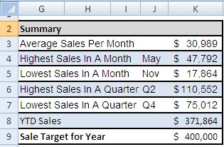
To create the summary I just repeat the formatting of the first two parts of the dashboard and use simple formulas to create the lookups. You will also notice that to create the Summary, I have a row for Sale Target for Year. This is hard coded but could be a lookup to a budget worksheet.
Again all of the formulas use basic Excel functions….
=AVERAGE(Sheet1!D4:D15)
=MAX(Sheet1!D4:D15)
=MIN(Sheet1!D4:D15)
=MAX(Sheet1!D18:D21)
=MIN(Sheet1!D18:D21)
=SUM(D4:D15)
For the lookups I could have used a combination of Indirect and Match as described in the following post…
However I opted to use helper cells. In the below image I have changed the font color from White to dark red for the helper cells to help you better understand the formulas. Now all of the helper cells are done by a function. For example cell F4 has the formula =C4. This way if I sort my data, the helper cells also sort.
Next on the dashboard, I create the Sales By Quarter bar chart and size it to fit.
Same with the Sales by Month bar chart (with trend line). No great mystery on creating a bar chart. To add the trend line (Excel 2007) from the ribbon select the Layout tab and under Analysis, select Trendline.
I format the Trendline as Polynomial with Order 4 to give it a smooth look.
Now all that’s left to create is the sweet little Sales by Month gauge / summary board in the upper right corner.
WARNING HERE COMES THE CONTROVERSY!!!!
People either love or hate the “Fuel Chart” or “Speedometer Chart”. I will concede that it can be misused and is usually not my first choice in graphs. However, used correctly it can be a powerful tool.
Besides a billion automobiles can’t be all wrong, if they were, we would all have bar charts on our car displays….
Now I won’t go into detail on how to get the Current, Trend, Goal info. That’s all covered above and done with simple lookups. But the speedometer graph is done by overlaying a donut chart with a pie chart.
To create this graphic, see my next post on creating a speedometer graph.