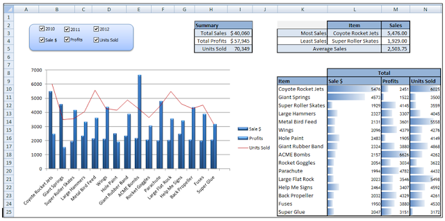
To continue with the dashboard in the prior two posts, I want to provide a summary on the dashboard. On my data table I create a summary section based on my entire data set. I could create this directly on my dashboard but I prefer to keep my data on separate tabs.
Since I have multiple records for each item in my dataset, I need to summarize them in this section. I use =SUMIF(G:G,R3,I:I) to get a total for the sale $. Remember that in a previous post
I showed how to use the SUMIF function. If I apply this to my original dataset my results will not be dynamic (change with the checkboxes selected on my dashboard. Instead I point the SUMIF to my dynamic data on my data tab. You didn’t read my post on creating dynamic data? (Click here)
I repeat the SUMIF formula for both the Profits and Units Sold column.
Finally I copy the ITEM name to column V.
Now with this information I can go back to my Dashboard and create a summary area.
The Most, Least and Average Sales in Column K is done with basic formulas. I use a min, max and average formula to populate the three cells.
=MAX(Data!S2:S18)
=MIN(Data!S2:S18)
=AVERAGE(Data!S2:S18)
To pull back the Item name, I use a Vlookup formula (I can use Vlookup because in a previous step I copied the ITEM name to column V in my data tab.
Next I will use conditional formatting to provide my data bars.
To start I use a simple cell reference =Data!R3 to bring back the Item. For sales $ Profits and Units Sold I repeat the process (=Data!S3, =Data!T3, =Data!U3). I copy that down for each item.
Next I highlight the Sales $ data (cells L10 – L25).
From the home tab, I select Conditional Formatting, Data Bars and select the blue color.
I repeat the process for both the Profits and Units Sold columns.
Now if you didn’t want the numbers to show behind the data bars, you can go into the Conditional Formatting rule (Home tab, Conditional Formatting, Manager rules). Click the edit rules button and then check Show bar only.
When done the dashboard starts to really take shape.
And since we based all the data on the dynamic data setup, when I check or uncheck my checkboxes in the (switch board), my data changes.


No comments:
Post a Comment