Last week I demonstrated how to create a box chart. Didn't see the post? click here
Someone wrote to me asking why they would ever want to
use a box chart when they could use a simple column chart to represent the same
data. Well it’s a good question so let’s look a bit closer at the two
techniques.
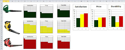
Here’s a simple dashboard comparing three different types
of leaf blowers. It also shows the box charts compared to column charts.
Notice how I matched the leaf blower color in my box
charts as well as my column charts. This helps provide continuity to the
dashboard. Both the box chart and column charts show the same information, but
the way it the data is represented is different.
And that’s the point. Excel allows you to represent data
in different ways. Most people will settle for the built in charts Excel
provides and that’s fine. However there are alternatives and the box chart is a
good example of this. It’s a creative use of conditional formatting that provides
a user the flexibility to display their data differently.
The person who emailed me also raised a valid point
regarding the columns and how I needed to size them to make the box chart. He
pointed out that it would be difficult to properly display data under these
boxes due to the column width. I agree. It would not be ideal to place data
under the boxes. However there is an easy solution.
Notice the columns D – M, O – X and Z – AK in the below
example. These are the columns that the reader was referencing. They are very
small in width.
To get around this problem, you can use the camera tool
to place the image of the chart onto your dashboard. The actual chart itself
can be on a different tab. And of course since you are using the camera tool,
the image is not static (it will change as your data changes).
In the attached example I have my box charts on the data
tab and the Dashboard “links to the box charts” by the use of the camera tool.
Now if you
are not familiar with the camera tool, you should become acquainted.
The camera
tool is a hidden feature in Excel that allows you to copy a rectangular area in
your workbook and then creates a mirror image of the area as a drawing object.
You can then move and resize the object. If the contents of original
rectangular area changes then the mirror image also changes.
To use the camera tool, you must add
the tool to a tool bar in excel menu area.
From the menu Click the drop down arrow on the tool bar and select More Commands
- From the menu Click the drop down arrow on the tool bar and select More Commands
- In the Customize tab and select All Commands.
- Scroll down in the commands area until you see a little camera icon.
- Click the Add Button then the OK button to add this to your tool bar.
To
use the camera tool on our box chart first highlight the chart. When I select
my cells they are outlined with a black boarder. Next click on the camera icon that we added
to our tool bar.
Now
click anywhere in your worksheet and Excel
will places a snapshot of the range you selected.
Now you can move
and resize this as needed.
Notice how my column widths are normal size on the
dashboard tab.
So using the camera tool allows you to
get around the problem of column widths.
The camera tool is a great feature in
Excel but there are some issues that you need to be aware of. As shown here if
you resize an image too small you will loose resolution. Also if you change the
aspect ration of the image, you will get distortion.


