Dashboard Dynamic Data - Designing a simple user interface

I wanted to review in greater detail how to make your data dynamic for use in charts and dashboards.
You can review 2 previous examples of this check box application here and here.

In the below sample data I have some basic information that I would like to make dynamic for use in a graph. To accomplish this I will place my dynamic data in columns H – L and use Checkboxes that the user can either check or uncheck to select the data they want to see.


To stat I want to add a checkbox from the form Controls. You can select the Developer Tab >Insert > then Check Box


I then drag the curser while holding down the left mouse button to create my checkbox in the worksheet.


I right mouse click on the newly added checkbox and select Edit Text and rename it to read “Customers”. As it stands now, there is no association to the sales column and the check box with the name customers. That association will be created using an =IF formula later.

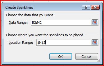
Next I right mouse click on the added checkbox and select Format Control. Here is where I want to assign the value of the check box to a specific cell. In this case I select cell I3.


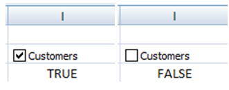
Now when the box is checked, cell I3 displays “True”. If it’s not checked, it displays “False”. Here I display the same Customers checkbox in both the True and False state.


Next I repeat the above process for the other columns, Customers, Returns and Total Profit making sure that I update the Cell Link for each column.


Now I can create an association to the columns of data and the checkboxes by using a simple =IF formulas to return my data when the checkbox target cell = “True”.

Cell I5 formula =IF(I$3,C5,NA())
Cell J5 formula =IF(J$3,D5,NA())
Cell K5 formula =IF(K$3,E5,NA())
Cell L5 formula =IF(L$3,F5,NA())

I copy this formula down my column for each row that has data (H5 – L16).


When done my columns will display the appropriate value when a box is checked and the text “#N/A” when the box is unchecked. Well right about now your thinking that this looks terrible, and you would be correct. However this is just a demonstration. In a real dashboard design I would have the dynamic data on a different tab where people cannot see it and the checkboxes would be at the top of the dashboard. The chart that gets created from the dynamic data would show on the dashboard.

Now let’s examine a simple graph using the above logic.

I create a basic line chart. When each checkbox for the data in my line chart is checked, my data is represented.


If I uncheck Customers and Total Profit the chart changes and you will notice that only Sales and Returns are represented in the chart.

So how does the graph know to remove the columns of data. Well it goes back to the =IF(I$3,C5,NA()) formula. If I had written the formula as =IF(I$3,C5,0), then when the checkbox was unchecked, a 0 would populate in the cell instead of a #N/A. That would cause my graph to still show the column of data but it would flat line at the bottom since the value would be 0. In the next example I have changed the formula for total profit to return a zero when the checkbox is not checked. You can see on the graph that total profits shows at the bottom of the graph as 0. Compare this to the customers column which is not displayed (since I still used the =IF(I$3,C5,NA()) formula in that column.


By default, data that is hidden in rows and columns in the worksheet is not displayed in a chart, and empty cells are displayed as gaps (remember our cells are not empty). For most chart types, you can display the hidden data in a chart.

For line, scatter, and radar chart types, you can also change the way that the empty cells are displayed in the chart. Instead of displaying empty cells as gaps, you can display empty cells as zero values, or you can span the gaps with a line. You can change how Excel displays empty cells when you select the data source by clicking on the Hidden and Empty Cells button.


However I prefer returning the #N/A. Now of course I can continue to clean up my chart, placing the customer value on a secondary axis, and add other features to clean it up. Notice that I moved the checkboxes and made the dynamic data font white to match the background. I then moved the final graph over the dynamic data.


So how can you apply the above techniques in your dashboards and charts to transform your data from the ordinary to the extraordinary?


DATE formula

The DATE formula is a versatile formula is normally used to build a date by providing the individual parts of the date (year, month, day).

Syntax
DATE Formula has three parts:
DATE (year, month, day)

year
year is the year in which the date would be occurring.

month
month is the month in which the date occurs.

day
day is the portion representing the day part of the date that we are trying to construct.

Example of a DATE Formula
 
Month
Day
Year
Result
Formula
10
31
2011
10/31/2011
=DATE(C2,A2,B2)

 Using the Date formula lets me take the individual components of a date and put them together. As shown above, I write the formula as =DATE(A2,B2,C2).

The result is October 31, 2011.

Formatting a DATE in Excel
You want to ensure that anytime you have a date in your spreadsheet, that it is formatted consistently.  Some countries display a date as yyyy-mm-dd while others use yyyy-dd-mm.

This can be critical as 2011-10-11 yyyy-mm-dd is not the same as 2011-10-11yyyy-dd-mm.

To format a date, while the cursor is on the cell or range of cells that you want to format then press Ctrl + 1. Choose the "Number" tab and click on "Date". In the "Type", select the format you want.

Please note that you are not limited to the days or months or years of a calendar. If I change the month to 14 in the above example I get the following...

Month
Day
Year
Result
Formula
14
31
2011
3/2/2012
=DATE(C2,A2,B2)
So what's happening in my formula???

Well if you start calculating month 1 as January, then 14 months would be February. However there are not 31 days in February so Excel rolls this into March and adjusts the day (adjusting for leap year.

This ability allows us to add/ subtract to days, months and years to get future or even past dates.

So no you know and the next time you are asked to figure out future dates, you will be able to "WOW" your audience. 

Sparklines

Sometimes a large graph is not practical but you still would like to include a graph to help convey your message.

Well in Excel 2010, Microsoft has introduced small micro charts called “sparklines”.  These micro charts aligned with rows of tabular data and often are used to show trends in data.

In the below example I have some sales numbers for the Acme Corporation. For each year I have a sparlkine in column N to graphically represent the yearly sales.


Creating the above sparkline chart is easy as One, Two, Three…

1. First select a blank cell to place the sparkline ( I chose the cells in column N).
2. Go to Insert > Sparkline and select one of three sparkline options (line, column or win-loss).
3. Specify the data for your sparkline and where you want the sparkline to be placed.


Finally format the sparkline as desired

Extracting numbers from the middle of a mixed string (text and numbers)

We often asked to make sense of imported data. Perhaps you are asked to extract information from within a string of data. Now in another post I showed how to extract numbers from the front of a string.
However, in this example I was asked to extract the middle numbers (starting with a 1 and going 5 digits). Well I broke out my mad crazy Excel skills and after an hour I came up with a solution utilizing 2 array functions, a Left, Mid, Find and Right function. I was smugly pleased with my result but it was not eloquent even though it solved my problem.
Line Description
85363D ATLANTA    18545  785050    369634011-10-05
85364D FLORIDA    11430  785050    369662011-10-05
85365D NY         11928  785050    363672011-10-05
85366D COLUS      13535  785050    810142011-10-05
85367D AMSTERDAM  14089  785050    810152011-10-05
85368D NEVA       14331  785050    369712011-10-05
85340D GEORGIA    14331  785050    369702011-10-05
If I had taken a moment to change the font to a true type (such as courier), I would have seen the following.
Line Description
85363D ATLANTA    18545  785050    369634011-10-05
85364D FLORIDA    11430  785050    369662011-10-05
85365D NEW YORK   11928  785050    363672011-10-05
85366D COLUMBUS   13535  785050    810142011-10-05
85367D AMSTERDAM  14089  785050    810152011-10-05
85368D NEVADA     14331  785050    369712011-10-05
85340D GEORGIA    14331  785050    369702011-10-05
With a courier font, all the columns that at first appeared to not line up, in fact did line up. In addition, in  every row that I needed, there was a common denominator (785050) (The above data is just a sample of the rows I needed - they were not grouped together in the original data). To use an old saying, "I was lost in the tall grass and could not see the obvious". This one column data that I was looking at was in a grouping of about 20 other columns and the outside distraction of those other columns helped obfuscate the pattern.
Well with this clear data I could scrap all my fancy array formulas and simple extract the data with the following code.
=IFERROR(MID(A2,(FIND(785050,A2,1))-7,5),"Not found")
I added the IFERROR because there were some records that did not have 785050.
So what does this formula do?
Well…
FIND(785050,A2,1)  - checks to see if the number 785050 is in my string that I am searching
MID(A2(  - uses the FIND to return the string I am looking for.
IFERROR – used to avoid #Error or N/A errors.
-7  - since I want to return the 5 digit number and I located the starting position of 785050, I needed to look to the left 7 characters to get my starting point.
Another way to get my answer would be to break out my data with Text To Columns. Since my data is aligned (and the record layout is apparent when I converted the text to courier), Text To Columns is another great way to break out my data without coding.
So what's the lesson to learn here? First always examine your data before you begin. You want to always compare apples to apples so convert the data to a true type font such as courier to help you identify patterns.