I want to create the calculations for this dashboard so this post will detail how to create the data that displays on this dashboard.
It starts with just some basic calculations to determine the Top and Low values of predetermined KPI’s. The calculations are displayed below the results. Remember that my raw data is on the Data tab and these calculations will reference this tab.
DATA TAB

CALCULATIONS TAB
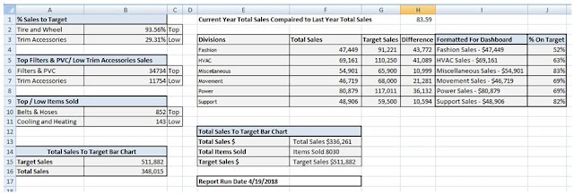

% Sales to Target | ||
=VLOOKUP(B2,Data!G:H,2,FALSE) | =MAX(Data!G2:G17) | Top |
=VLOOKUP(B3,Data!G:H,2,FALSE) | =MIN(Data!G2:G17) | Low |
="Top "& A6 & "/ Low " & A7 & " Sales" | ||
=VLOOKUP(B6,Data!C1:H17,6,FALSE) | =MAX(Data!C2:C17) | Top |
=VLOOKUP(B7,Data!C1:H17,6,FALSE) | =MIN(Data!C2:C17) | Low |
Top / Low Items Sold | ||
=VLOOKUP(B10,Data!E1:H17,4,FALSE) | =MAX(Data!E2:E17) | Top |
=VLOOKUP(B11,Data!E2:H18,4,FALSE) | =MIN(Data!E2:E17) | Low |
Total Sales To Target Bar Chart | ||
Target Sales | =SUM(Data!D2:D17) | |
Total Sales | =SUM(Data!C2:C17) | |

Now it is important to note that the calculations used are all basic.
=Vlookup
=IF
=Max for Top values
=Min for Low values
=Sum calculations as well as basic addition, subtraction and division.
There are also a few =Concatenate functions to pull names and values together.
Let’s look at columns A B and C. Here are the calculations…
Here are the calculations for columns E – J.

Not get too wrapped up in all these calculations; at the end of the post I will have a link to the worksheet for your review.
The take away from this (if there is one) is that you should keep your calculations on a separate tab from your data for easy reference. You should also take your time and break down what seems complex into smaller manageable components.