Showing posts with label Tweet Board. Show all posts

KPI Sales Dashboard with Fuel Gauge Part 3 of 3

Continuing with the last two posts on creating this sales dashboard…. Wait you didn’t the last two posts? Well get caught up by checking them out.

I want to focus today on creating the gauge chart. I add a tab labeled Gauge Chart and add the following information.


A
B
C
1
Column B Formulas
Needle
Value
2
180
      83.59
3
=((B2/100)*C2)-1
149.4575
4
2
5
=360-SUM(B2:B4)
28.54245
6
=SUM(B2:B6)
360


Now in cell C2 I have a hard coded value so that I can setup my gauge chart. I will eventually point this cell to the calculations tab for Current Year Total Sales Compared to Last Year Total Sales. But for now I want it hard coded so that I can change my number (allowing me to position my needle on the gauge chart).

The total value of my needle column B is 360 which matches the degrees of a circle. The 2 represents the pie wedge that will be the needle of my gauge. If I want the needle to be thicker, I can increase this value to be 3, 4 or 5.

This creates the framework for my gauge chart.


To create my gauge I start by highlighting cells 3B through B6. I then select Insert > Pie > 2-D Pie.


Next I want to rotate the pie chart 90 degrees clockwise placing the blue portion on the bottom. To do that, right mouse click on the blue area of the pie chart and select Format Data. Under Series Options, select Angle of first slice and set it to 90. When you close the window you will see the chart has rotated.


Now we have the foundation for the chart. You won’t need the legend on the right so you can remove it by left mouse clicking on it then pressing the delete key.

Next I want to make the bottom ring of the circle transparent. I left double click on the bottom section to select the bottom portion of the circle to select it and then right mouse click on it. I select Format Data Point to bring up the Format Data Point Dialog Box. I click the Fill option and select No Fill. If the boarder is visible, I also change the boarder color to no fill.


I repeat this process removing the red and purple portions of the pie chart (leaving only the green “needle”.

I make the whole pie chart background transparent by clicking on the pie chart and then selecting from the format tab > Shape Styles >Shape Fill > no fill. I also change the needle color to red by double clicking on the green area and changing the fill color to red.

When done I have my needle.


I can cut the pie chart than past it onto my dashboard tab. I little bit of adjusting and I can align the needle just the way it needs to be.


Now you are probably noticing the numbers in the gauge. I create each number as a separate text box (Insert tab > Text > Text Box) and then move them into the correct position. 

The 83.59% of Sales Goal is created with a text box also. I point the text box to cell A22 which I have changed the color of the cell text from black to white so you can see it. The formula is listed in cell A24 for your reference.


The tweet boards are created the same way, pointing a text box to the appropriate cell on the calculation tab. For example the formula for Fashion Sales is =Calculations!I4. HVAC Sales is =Calculations!I5.


Same with the oval tweets, these are simple text boxes pointing to the calculations tab.
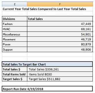


To finish I add a few column charts for the side gauges and I have a completed dashboard.

Well there are many steps to create this dashboard, but most of them are repetitive in nature and once you create one, you can easily replicate the step for the other components.


KPI Sales Dashboard with Fuel Gauge Part 1 of 3

Time to kick up the wow factor this week. Two posts ago I spoke of my new Ford Focus with dashboard noise. This got me thinking about creating a KPI dashboard that looks like an automobile dashboard. For inspiration I went to Google and found the following image.


Hmmm. I like the idea of one primary fuel gauge as well as multiple side indicators. Well I broke out the whiteboard (i.e. paper, then PowerPoint) and after a bit of time came up with the following design.


I want to focus on the basic concepts for creating this dashboard without deeply diving on the relevancy of the data as the data represented can be anything you wish.
Although the above dashboard seams complex, it really isn’t. To create the above dashboard, I only have 4 bar charts, a few text boxes, and one fuel or gas gauge. All the steps necessary to create this dashboard are easy to create.
As always I start with my data and since this is an automotive dashboard, I created some sample sales and target data for auto parts.
Division
Category
 Total Sales
 Target Sales
Items Sold
Power
Batteries
         19,537
           24,000
427
Miscellaneous
Belts & Hoses
         20,167
           27,900
852
Movement
Brakes
         26,189
           40,000
326
HVAC
Climate Control
         33,335
           40,250
713
HVAC
Cooling and Heating
         22,969
           33,000
143
Movement
Drivetrain
         20,530
           28,000
224
Power
Electrical & Lighting
         19,271
           35,000
579
HVAC
Exhaust
         12,857
           37,000
275
Fashion
Exterior
         21,453
           27,750
337
Power
External Engine
         27,214
           30,000
359
Miscellaneous
Filters & PVC
         34,734
           38,000
753
Power
Fuel Delivery
         14,857
           28,011
578
Fashion
Interior
         14,242
           23,367
795
Support
Suspension and Steering
         28,322
           37,500
676
Support
Tire and Wheel
         20,584
           22,000
214
Fashion
Trim Accessories
         11,754
           40,104
779


From this basic data I was able to add the following columns.
Avg Sale Price Per Item
% Sales to Target
Category
Last Year Sales


Here are the calculations for the data…


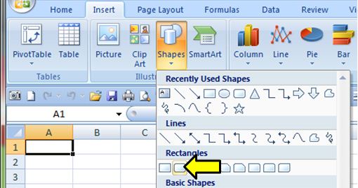
Well with the data setup, I start the dashboard. I format the entire worksheet black. I then create 4 rounded rectangle shapes
 Insert Tab > Shapes > Rounded Rectangle.


I size the shapes 1.42 high and 1.25 wide. I shade them light blue with a darker blue outline. These will form the background for the bar charts. I also added some gradient filling for each object Format tab > Shape Fill > Gradient > Linear up.


I also create 6 more rounded rectangles shapes .42 high by 2.92 wide to accommodate the tweet boards.


4 ovals are created the same way .81 High by 1.08 wide. All of these objects have the same boarders and gradient fill colors.
Finally I create the centerpiece of the dashboard, the large oval in the center 3.5 High by 4 wide. I set no fill for the shape fill and give the outline a light blue color. When done I arrange these items into the following pattern. From the Format Tab I can order the objects by using the Bring to Front / Send to Back options.


Now in the above example the center oval shows behind the rectangles. You can remove this if you wish by adding a black rectangle over the bottom of the center oval and then bring the blue rectangles to the front (as in the sample dashboard at the beginning of this post. However you might like to have the full oval.
Well so much for the fun part of this dashboard, time to get to work. I need to create a calculations tab to place all the relevant data that will be displayed so name one of my sheets to Calculations and while I am at it, I name another sheet Gauge Chart. When done I have 4 sheets, Dashboard, Data, Calculations and Gauge Chart.


In part 2 of this series, I will show you how to create the calculations that will display on the dashboard.