
Continuing with the last two posts on creating this sales dashboard…. Wait you didn’t the last two posts? Well get caught up by checking them out.
I want to focus today on creating the gauge chart. I add a tab labeled Gauge Chart and add the following information.

| | A | B | C |
| 1 | Column B Formulas | Needle | Value |
| 2 | 180 | 83.59 | |
| 3 | =((B2/100)*C2)-1 | 149.4575 | |
| 4 | 2 | ||
| 5 | =360-SUM(B2:B4) | 28.54245 | |
| 6 | =SUM(B2:B6) | 360 |
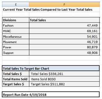
Now in cell C2 I have a hard coded value so that I can setup my gauge chart. I will eventually point this cell to the calculations tab for Current Year Total Sales Compared to Last Year Total Sales. But for now I want it hard coded so that I can change my number (allowing me to position my needle on the gauge chart).
The total value of my needle column B is 360 which matches the degrees of a circle. The 2 represents the pie wedge that will be the needle of my gauge. If I want the needle to be thicker, I can increase this value to be 3, 4 or 5.
This creates the framework for my gauge chart.
To create my gauge I start by highlighting cells 3B through B6. I then select Insert > Pie > 2-D Pie.


Next I want to rotate the pie chart 90 degrees clockwise placing the blue portion on the bottom. To do that, right mouse click on the blue area of the pie chart and select Format Data. Under Series Options, select Angle of first slice and set it to 90. When you close the window you will see the chart has rotated.

Now we have the foundation for the chart. You won’t need the legend on the right so you can remove it by left mouse clicking on it then pressing the delete key.
Next I want to make the bottom ring of the circle transparent. I left double click on the bottom section to select the bottom portion of the circle to select it and then right mouse click on it. I select Format Data Point to bring up the Format Data Point Dialog Box. I click the Fill option and select No Fill. If the boarder is visible, I also change the boarder color to no fill.
I repeat this process removing the red and purple portions of the pie chart (leaving only the green “needle”.
I make the whole pie chart background transparent by clicking on the pie chart and then selecting from the format tab > Shape Styles >Shape Fill > no fill. I also change the needle color to red by double clicking on the green area and changing the fill color to red.
When done I have my needle.

I can cut the pie chart than past it onto my dashboard tab. I little bit of adjusting and I can align the needle just the way it needs to be.

Now you are probably noticing the numbers in the gauge. I create each number as a separate text box (Insert tab > Text > Text Box) and then move them into the correct position.
The 83.59% of Sales Goal is created with a text box also. I point the text box to cell A22 which I have changed the color of the cell text from black to white so you can see it. The formula is listed in cell A24 for your reference.

The tweet boards are created the same way, pointing a text box to the appropriate cell on the calculation tab. For example the formula for Fashion Sales is =Calculations!I4. HVAC Sales is =Calculations!I5.


Same with the oval tweets, these are simple text boxes pointing to the calculations tab.
To finish I add a few column charts for the side gauges and I have a completed dashboard.
Well there are many steps to create this dashboard, but most of them are repetitive in nature and once you create one, you can easily replicate the step for the other components.
No comments:
Post a Comment