In this second post for creating Dynamic Dashboards I will continue with the development of the Dynamic Dashboard. In my previous post I showed you how to create checkboxes and link the checkboxes to data.
I want to turn my attention to the Year column. In my data I have 3 years of data. Current Year, Prior Year and 2 years back (2012, 2011 and 2010).
Just as I did in my prior post, I create checkboxes (one for each year).
I Assign each checkbox to cell M3, M4 and M5. Just as with my data, True or False now display in these cells. I next add in column N the numbers 2010, 2011, and 2012. This is useful to show which year has a True value.
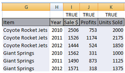
Now with my original formulas in columns I J and K, the data entire column would show or not show depending on the True or False in row 1. However I want the Year to also control if the data should show. So I want to modify the formula to also show across the row.
I could accomplish this in a few ways but will add an extra step here to help you understand how to do it.
In cell O3 I add the following formula. =IF(M3, N3) and copy it down for each year. This formula returns the year if the corresponding value in column M is True. Now I can compare this result to the year for each item.
I now change my formulas in columns H I J and K.
Column H =IF(COUNTIF(O$2:O$11,B3) = 1,B3,"FALSE")
This takes the value in column B, and sees if it exists in column O, If it does, it displays the Year.
The rest key off of this formula and then check the True or False at the top of the columns.
Column I =IF($H3 <> "FALSE",IF(I$1,C3),"FALSE")
Column J =IF($H3 <> "FALSE",IF(J$1,D3),"FALSE")
Column K =IF($H3 <> "FALSE",IF(K$1,E3),"FALSE")
Now my data is dynamic Vertical and horizontally.
Now for the fun part, creating the Dynamic Dashboard.
I insert a rounded rectangle shape and place it around the checkboxes giving it a light blue background. I have also made the entire worksheet background all white.
To create my Column Chart I select my data ( I highlight my data including the header for Item, Sale $, Profits and Units Sold. (I don’t want to include Year). I can do this by holding down the CTRL key when selecting my columns.
I then create a 2D column chart.
I cut the chart and paste it under my checkboxes.
I remove the outline of the chart (shape outline) and change the design of the chart (Style 27).
Left mouse click on one of the Units Sold bars will select all the Units Sold bars. I change the chart type to be Line.
I format the data series by right mouse clicking on the line. I change the line color to red and the Width to 1. Now I go back to my data and add totals to each column.
I add a summary section on my dashboard and link the cell for each total to the totals I just added to my data.
I could continue to fine tune the data but you should have a good idea of how to improve this concept. So give it a try the next time you need to WOW your boss.
How would you use this technique to bring your dashboards and charts to life?


No comments:
Post a Comment