Showing posts with label FORM CONTROLS. Show all posts

Dynamic Dashboards Using Dynamic Charts Part 2 of 3

In this second post for creating Dynamic Dashboards I will continue with the development of the Dynamic Dashboard. In my previous post I showed you how to create checkboxes and link the checkboxes to data.
I want to turn my attention to the Year column. In my data I have 3 years of data. Current Year, Prior Year and 2 years back (2012, 2011 and 2010).
Just as I did in my prior post, I create checkboxes (one for each year).


I Assign each checkbox to cell M3, M4 and M5. Just as with my data, True or False now display in these cells. I next add in column N the numbers 2010, 2011, and 2012. This is useful to show which year has a True value.
Now with my original formulas in columns I J and K, the data entire column would show or not show depending on the True or False in row 1. However I want the Year to also control if the data should show.  So I want to modify the formula to also show across the row.
I could accomplish this in a few ways but will add an extra step here to help you understand how to do it.
In cell O3 I add the following formula.  =IF(M3, N3) and copy it down for each year. This formula returns the year if the corresponding value in column M is True. Now I can compare this result to the year for each item.


I now change my formulas in columns H I J and K.
Column H            =IF(COUNTIF(O$2:O$11,B3) = 1,B3,"FALSE")
This takes the value in column B, and sees if it exists in column O, If it does, it displays the Year.
The rest key off of this formula and then check the True or False at the top of the columns.
Column I              =IF($H3 <> "FALSE",IF(I$1,C3),"FALSE")
Column J              =IF($H3 <> "FALSE",IF(J$1,D3),"FALSE")
Column K             =IF($H3 <> "FALSE",IF(K$1,E3),"FALSE")

Now my data is dynamic Vertical and horizontally.
Now for the fun part, creating the Dynamic Dashboard.
I insert a rounded rectangle shape and place it around the checkboxes giving it a light blue background. I have also made the entire worksheet background all white.

To create my Column Chart I select my data ( I highlight my data including the header for Item, Sale $, Profits and Units Sold. (I don’t want to include Year).  I can do this by holding down the CTRL key when selecting my columns.


I then create a 2D column chart.


I cut the chart and paste it under my checkboxes.
I remove the outline of the chart (shape outline) and change the design of the chart (Style 27).


Left mouse click on one of the Units Sold bars will select all the Units Sold bars. I change the chart type to be Line.
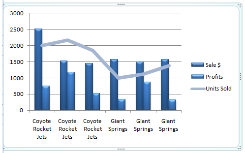


I format the data series by right mouse clicking on the line. I change the line color to red and the Width to 1. Now I go back to my data and add totals to each column.


I add a summary section on my dashboard and link the cell for each total to the totals I just added to my data.
I could continue to fine tune the data but you should have a good idea of how to improve this concept. So give it a try the next time you need to WOW your boss.
How would you use this technique to bring your dashboards and charts to life?

Dynamic Dashboards Using Dynamic Charts Part 1 of 3

Dashboards are a great way to display data in a concise way. However the person viewing your data may want to break out the data in a way more meaningfully to their own goals. One great way of doing this on a dashboard is to make the dashboard interactive.
Now in a previous post I showed how to create a static dashboard using a combination of bar charts, trend indicators, conditional formatting and fuel gauge graphics.
In the next few posts I will walk through setting up a dashboard for the ACME Supply Company.
Let’s start by looking at some raw data. Here are yearly sales for the two best selling products produced by the ACME Supply Company (Coyote Rocket Jets and Giant Springs).
I want to present this data in a dashboard used by the ACME Supply sales department. I am not much of a visual basic script developer and tend to fly by the seat of my pants (much like the coyote) so I don’t want to be locked into a PowerPoint presentation. I also want this report updatable so it can be used over and over. So my best solution is to use Excel.
My primary tool for creating the interactive dashboard interface will be check boxes. A check box allows for simple Boolean logic (checked or not checked).  To start I place my data in one tab and on a second tab I want to create my dashboard. On the dashboard tab I want to first add my checkboxes.
From the Developer tab, in the Controls group, click Insert and then, under Form Controls (top area), click the Check box .


Click the worksheet location where you want the upper-left corner of the control to appear. Hold down the left mouse button and drag the mouse to insert the checkbox.
When done you will want to modify the properties of your new check box by right mouse clicking on the Check box.  You will want to assign the value of the checkbox to a cell so we can use is in formulas. I assigned the value to the cell I1 in on my Data tab


I also change the word Check Box 1 to Sales $.


No whenever I check the Sales $ checkbox, the word True appears in cell I1.
 I repeat the process for Profits, and Units Sold. When done, I have 3 check boxes that will display True or False depending on if they are checked. Notice in the example below Profits are unchecked and displayed with FALSE in my data.


I can then reference these True or False values in formulas.
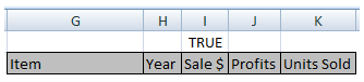
 In this sample my Data is in columns A through E. My formula to verify if the check boxes are checked or not checked are in columns G through K. Notice that since cell J1 is FALSE (the profits checkbox is unchecked), no value is passed into the fields.
Here are the formulas I use in my calculated fields, You can enter them in cells I3 J3 and K3 and then copy down for each row of your data…
=If(I$1$,C3,NA())    – If the value of cell I1 is True, then return the value in cell C3, else return FALSE.
Now my data is dynamic based on the checkboxes. I can use this dynamic data to create my chart.
I will show how to do that in my next post.