Showing posts with label Donut Chart. Show all posts

Fuel Gauge Redo


Earlier this week I had a reader comment on my Fuel Gauge dashboard graphic. Not familiar with what a fuel gauge chart is, click here see my earlier post.

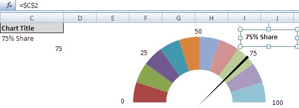
Basically a Fuel Gauge graphic represents a percentage from 0 to 100. The concept is based on a pie chart. Here is an example of what one looks like.


My reader liked the concept but wanted to add a twist to it. He wanted the gauge to represent numbers from 70 to 100 and couldn't figure out how to convert it.


Well as a former coder I often say it’s only 1s and 0s. Anything is possible. So how do we convert the above fuel gauge to the one that works from 70 – 100?

Well first we need to understand the concept of the gauge.

Where my gauge would show 0, his will show 70, my 25 would be his 77.5, my 50 would be his 85, etc…
To convert the gauge I need to setup a matrix and it starts with a basic question. What is the difference between milestones on his gauge?

your #
   77.50
My #
25
Your Starting #
   70.00

     7.50
 7.5/25 =
0.3000

I randomly choose one of his milestones (70, 77.5, 85, 92.5 or 100)

I then choose the next lower milestone and subtract the two.

In this case I chose 77.50 as the starting milestone and 70 and the previous milestone. The difference between these two numbers is 7.5. If I chose 85 and 77.5 I would again get 7.5 when I subtract them. So 7.5 is my first key for converting my gauge.

Next I take the first milestone of 77.50 and identify what that would be on my gauge (25). I then divide the 7.5 by 25 and get a conversion factor of 0.30 (7.5/25=0.30).

Now I can create my conversion matrix based on the 0.30 number. I create a column and run numbers from 0 to 100. I then start with the readers low score (70) adding 0.30 to each subsequent number. In the below example I show the first 11 numbers of my scale from 0 to 100. The readers scale increases 0.30 in each row.

Column P
Column Q
Your Scale
My Scale
             70.00
0
             70.30
1
             70.60
2
             70.90
3
             71.20
4
             71.50
5
             71.80
6
             72.10
7
             72.40
8
             72.70
9
             73.00
10

Another way to get this number is to subtract the users high and low value and multiply that by 0.01.  (100-70)*0.01 = 0.30

Now that I have my matrix setup I just need to do a vlookup to convert the percentage entered by a user.
=VLOOKUP([Number Entered By User],P:Q,2,TRUE). This formula is shown in cell D3 of the converted Versions tab in the spreadsheet that you can download at the end of this post.

I need to use TRUE in my vlookup instead of false since with true, if an exact match is not found, the next largest value that is less than lookup_value is returned.

The vlookup result converts the user’s number into my gauge number from 0 to 100 and the needle points correctly.


Speedometer Chart / Gas Gauge Chart


A speedometer graph is comprised of multiple components to give the illusion of one chart. The background is an image or donut chart. The needle is created with a pie chart. The numbers and text are done with text boxes.

To start you want to lay out your preliminary data. The following 3 columns contain all the data I will need to create the chart. You will notice that I have formulas in 3 cells. I have displayed them for reference. You will also notice that in row 14 I sum the above data and each column (A, B and C) total is 360 (the same amount of degrees in a circle). The needle will represent any position on the chart based on the value entered in cell C2.


To create the chart, highlight cells A2 through A12 (don’t include the header row). Create a Donut Chart (shown below using Excel 2007)…


This creates the necessary components to create the first half of the Donut Chart.


You want to rotate the chart 90 degrees so the solid blue portion is positioned at the bottom. To do that, right mouse click on the donut ring and select Format Data. Under Series Options, select Angle of first slice and set it to 90. When you close the window you will see the chart has rotated.


Now we have the foundation for the chart. You won’t need the legend on the right so you can remove it by left mouse clicking on it then pressing the delete key.

Next I want to make the bottom ring of the circle transparent. I left double click on the bottom section to select the bottom portion of the circle and then right mouse click on it. I select Format Data Point to bring up the Format Data Point Dialog Box. I click the Fill option and select No Fill. If the boarder is visible, I also change the boarder color to no fill.

In the below example I am in the process of making the bottom circle transparent.

When Done I am left with the following.


Now I want to work on the needle of this chart. I first highlight cells C2 through C5 and create a Pie Chart.


Just as I did with the donut chart, I want to rotate the Pie Chart 90 degrees and remove the legend to the left.


I also want to make the Red, Blue and Purple sections of the Pie chart transparent without any boarders (just like the bottom of the donut). This will leave me with just the needle showing.


I make the whole pie chart background transparent. And the needle is shown on top of my donut chart.

You can also resize the needle by changing the pie chart size and then moving the Pie chart so it still is aligned correctly over my donut chart. In this example I have the needle slightly extending beyond the arch of the donut chart.

I also have changed the needle color to be black….


Well now you can test you chart by changing the value in cell C3. Set it to 0 and also 100. Check the position of the needle and readjust the pie chart as needed.

Now I want to add some numbers as indicators on the gauge. I simply insert a text box for each label I want to use. (In Excel 2007 from the Ribbon, Insert Tab >> Text Box). Make sure the background and outline of the text box is transparent.


I position by changing the value in cell C3 for each text box I have. This helps me position the text correctly.

Almost done! Now I want to add a heading to the gauge. This is where cell C2 come in. I insert another text box but instead of typing in text, I place an = in the formula bar and then select cell C2.

Now I was creating this chart to show a percent of holdings for an account so I used the word Share. You could just as easily put the word Percent, Total or any other text you want.


The last thing I want to do to complete this is to group all the components of this chart together so that I can resize the graph as needed.

From the Ribbon (Excel 2007) I select my items and then on the Format Tab I choose Group.
Depending on what you group first you may need to arrange the items on the chart again by bringing items forward or moving items backwards.

When done you have a fully functional speedometer graph or Gas Gauge chart. Used judicially, this little graphic can turn your ordinary dashboard into a “WOW did you see that dashboard”.

Now what if we wanted to dress the dial up some more.

Perhaps I wanted to do a gradient fill from left to right. Well to do that I would change my data in the dial column to be only two equal rows.


I then continue with the above procedure but when I select fill for the top section of the donut, I choose a Gradient fill and select the colors I want and direction of the angle.


Using the same technique, I can use 3 data points for my dial


Perhaps you are looking for a more realistic graphic. Just past in a picture and overlay the pie chart. Tweak the data to ensure the needle does not pass the E or F and viola!


So how would you use this technique in your dashboards?