This week I wanted to take a closer look at conditional formatting and point out some simple ways to represent data.
In the below worksheet I have values between 1 and 100 in column A.
I have used different versions of conditional formatting to represent the data in a variety of ways.
To start I pass my data into columns C, E and I using a simple formula =A2. I then copy that formula down to the remaining 19 rows. To create each column I do the following.
RANK
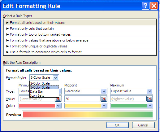
I create my conditional formatting by using a Format all cells based on their values rule. I select the Icon Sets as the format style. For the Icon style I select 3 Traffic Lights (Unrimmed). Selecting the drop down arrow for Icon Style will give you many different graphic representations that you can select from.
I tweak the values and Type and when done I select the OK button and then apply the conditional formatting by clicking on the apply button.
3 Color Scale Data Bars and 2 Color Scale
All three of these are Format Style variations.
I create my conditional formatting by using a Format all cells based on their values rule. I select one of the format styles and tweak the colors as needed.
Using these simple conditional formatting options can give your reporting and dashboards an added punch of style.
How have you used conditional formatting in your reporting?


No comments:
Post a Comment