Time to kick up the wow factor this week. Two posts ago I spoke of my new Ford Focus with dashboard noise. This got me thinking about creating a KPI dashboard that looks like an automobile dashboard. For inspiration I went to Google and found the following image.
Hmmm. I like the idea of one primary fuel gauge as well as multiple side indicators. Well I broke out the whiteboard (i.e. paper, then PowerPoint) and after a bit of time came up with the following design.
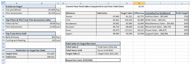
I want to focus on the basic concepts for creating this dashboard without deeply diving on the relevancy of the data as the data represented can be anything you wish.
Although the above dashboard seams complex, it really isn’t. To create the above dashboard, I only have 4 bar charts, a few text boxes, and one fuel or gas gauge. All the steps necessary to create this dashboard are easy to create.
As always I start with my data and since this is an automotive dashboard, I created some sample sales and target data for auto parts.
Division | Category | Total Sales | Target Sales | Items Sold |
Power | Batteries | 19,537 | 24,000 | 427 |
Miscellaneous | Belts & Hoses | 20,167 | 27,900 | 852 |
Movement | Brakes | 26,189 | 40,000 | 326 |
HVAC | Climate Control | 33,335 | 40,250 | 713 |
HVAC | Cooling and Heating | 22,969 | 33,000 | 143 |
Movement | Drivetrain | 20,530 | 28,000 | 224 |
Power | Electrical & Lighting | 19,271 | 35,000 | 579 |
HVAC | Exhaust | 12,857 | 37,000 | 275 |
Fashion | Exterior | 21,453 | 27,750 | 337 |
Power | External Engine | 27,214 | 30,000 | 359 |
Miscellaneous | Filters & PVC | 34,734 | 38,000 | 753 |
Power | Fuel Delivery | 14,857 | 28,011 | 578 |
Fashion | Interior | 14,242 | 23,367 | 795 |
Support | Suspension and Steering | 28,322 | 37,500 | 676 |
Support | Tire and Wheel | 20,584 | 22,000 | 214 |
Fashion | Trim Accessories | 11,754 | 40,104 | 779 |
From this basic data I was able to add the following columns.
Avg Sale Price Per Item | % Sales to Target | Category | Last Year Sales |
Here are the calculations for the data…
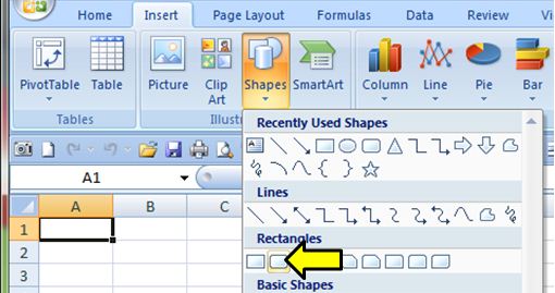
Well with the data setup, I start the dashboard. I format the entire worksheet black. I then create 4 rounded rectangle shapes
Insert Tab > Shapes > Rounded Rectangle.
I size the shapes 1.42 high and 1.25 wide. I shade them light blue with a darker blue outline. These will form the background for the bar charts. I also added some gradient filling for each object Format tab > Shape Fill > Gradient > Linear up.
I also create 6 more rounded rectangles shapes .42 high by 2.92 wide to accommodate the tweet boards.

4 ovals are created the same way .81 High by 1.08 wide. All of these objects have the same boarders and gradient fill colors.
Finally I create the centerpiece of the dashboard, the large oval in the center 3.5 High by 4 wide. I set no fill for the shape fill and give the outline a light blue color. When done I arrange these items into the following pattern. From the Format Tab I can order the objects by using the Bring to Front / Send to Back options.
Now in the above example the center oval shows behind the rectangles. You can remove this if you wish by adding a black rectangle over the bottom of the center oval and then bring the blue rectangles to the front (as in the sample dashboard at the beginning of this post. However you might like to have the full oval.
Well so much for the fun part of this dashboard, time to get to work. I need to create a calculations tab to place all the relevant data that will be displayed so name one of my sheets to Calculations and while I am at it, I name another sheet Gauge Chart. When done I have 4 sheets, Dashboard, Data, Calculations and Gauge Chart.
In part 2 of this series, I will show you how to create the calculations that will display on the dashboard.